
3 posts tagged with "CSS"

View all tags

Why "Multiples of 8" Are the Standard for Spacing in CSS

· 2 min read

In modern UI design, the rule of setting "spacing in multiples of 8" is commonly used. This is not just a convention, but an empirical rule supported by the mathematical consistency of screen density, typography, and scale.

Addressing Various Screen Densities

Modern displays have pixel ratios such as 1x, 1.5x, 2x, 3x, and 4x.

Value1x1.5x2x3x4x
8 px812162432
5 px57.5 ⚠️101520

Since 8 is divisible into integers for many scales, it minimizes blurring caused by subpixel rendering. Using values like 5 px can generate fractions like 7.5 px in a 1.5x environment, leading to inaccurate rendering.

Compatibility with Typography

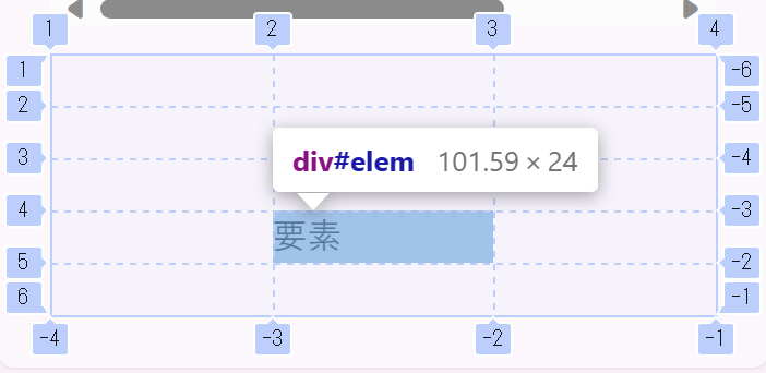
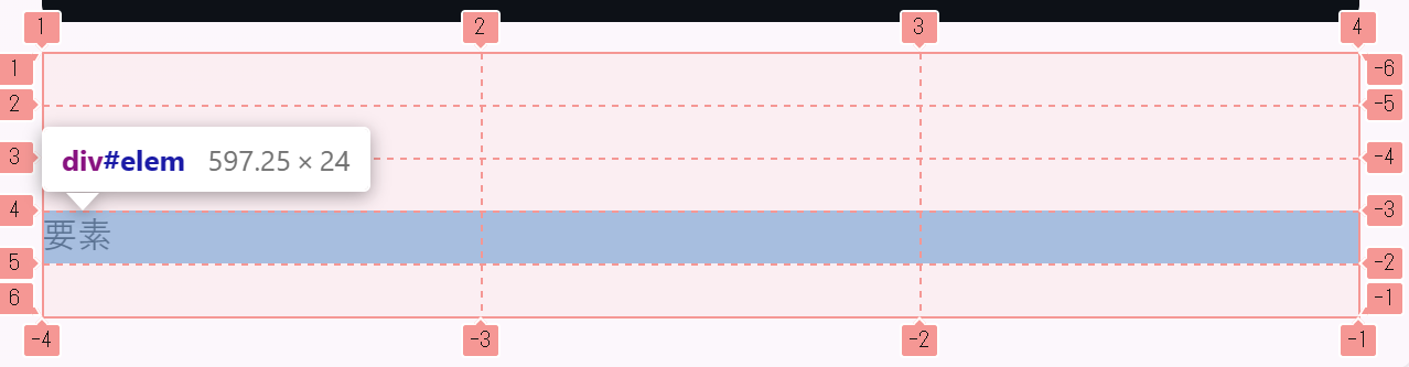
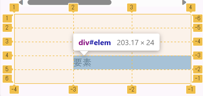
The default font size in browsers is 16 px (= 8 × 2). Line height is typically 1.5 times that, which equals 24 px (= 8 × 3).

By setting spacing in multiples of 8, the rhythm of the text can visually align more easily. The height of headings and body text matches the spacing grid, creating a well-organized vertical rhythm.

Ease of Creating Design Tokens

--space-1: 8px;
--space-2: 16px;
--space-3: 24px;
--space-4: 32px;

The scale is simple, making it easy for designers and engineers to utilize as a common language. Material Design and Tailwind CSS also adopt this philosophy.

When a designer specifies "space-3," the engineer can confidently apply 24px. A consistent naming convention reduces the communication cost during code reviews.

The Option of a 4 px Base

For UIs that require finer adjustments, a 4 px base (4, 8, 12, 16...) is also common. Tailwind CSS adopts a default 4 px base (p-1 = 4px).

The 4 px base is a subset of the 8 px base, so both can coexist without contradiction. It is effective to use 4 px units for small spacings within components, while using 8 px units for larger spacings between sections.

Conclusion

The reasons for using multiples of 8 as the standard for spacing can be summarized in three points:

  1. Addressing Screen Density: It divides into integers across many pixel ratios, preventing subpixel blurriness.
  2. Consistency with Typography: Aligns with the default font size (16 px) and line height (24 px), creating a vertical rhythm.
  3. Consistency in Scale: A simple token system serves as a common language for designers and engineers.

Why Bold Text Uses Gothic (Sans-serif) Font in Japanese Typography

· 2 min read

Even when body text uses Mincho (serif) typeface, bold text typically renders in Gothic (sans-serif). This is an intentional design choice rooted in readability, visual clarity, and historical printing conventions.

Readability

Simply bolding Mincho type creates a severe contrast between the serifs and main strokes, causing the counters (the enclosed or partially enclosed spaces within a character) to collapse — especially at small sizes on screens. The result is dense, hard-to-read text.

Gothic type lacks serifs entirely, so increasing the weight preserves counters and maintains legibility.

Visual Clarity

Switching font families entirely sends a clearer "this is emphasized" signal to the human visual system than merely darkening the same typeface. The contrast between Mincho body text and Gothic bold is immediately recognizable as intentional emphasis.

Historical Convention

In traditional Japanese letterpress printing, emphasis was expressed by switching typefaces rather than increasing weight. Casting heavier Mincho type posed physical constraints, so Gothic — a structurally distinct face — was used for emphasis instead. This convention carried over into digital typesetting and the web.

CSS Implementation

When using Mincho as the base typeface on the web, switching to Gothic for bold elements is straightforward:

body {
font-family: "Noto Serif JP", serif;
}

strong, b, h1, h2, h3, h4, h5, h6 {
font-family: "Noto Sans JP", sans-serif;
font-weight: 700;
}

This approach also has a practical advantage: only two weights need to be loaded — Regular Mincho for body text and Bold Gothic for emphasis — reducing font delivery overhead.

Summary

Three reasons Japanese bold text uses Gothic type:

  1. Readability: Gothic maintains counters at higher weights, keeping text legible
  2. Visual clarity: A typeface switch communicates emphasis more effectively than weight alone
  3. Convention: The letterpress-era rule of "use a different face for emphasis" carried over into digital and web typography

This combination is rational from both a design and web performance perspective.

Mastering CSS Grid

· 2 min read

Creating a Grid

5 Rows, 3 Columns Grid

Let's try creating a grid with 5 rows and 3 columns.

<div id="wrap">
<div id="elem">要素</div>
</div>
#wrap{
display: grid;
grid-template-columns: repeat(3, 1fr);
grid-template-rows: repeat(5, 1fr);
}

1fr denotes an equal fraction of the available space. repeat(3, 1fr) is equivalent to repeating 1fr three times, which, when written out, would be 1fr 1fr 1fr.

Also, auto is used when you want the grid items to adjust their size to the content within the grid.

Placing Items

After defining the grid, we place the items. Item placement is done using grid-row and grid-column. (However, it's also possible to use grid-row-start, grid-row-end, grid-column-start, and grid-column-end.)

Let's say we want to place an item at row 4, column 2, as shown in the figure.

Alt text

Since the 4th row is between lines 4 and 5, we set grid-row: 4 / 5;, and since the 2nd column is between lines 2 and 3, we set grid-column: 2 / 3;.

#elem{
grid-column: 2 / 3;
grid-row: 4 / 5;
}

Full-width Placement

Alt text

If you want to place an item across the full width of the 4th row, since the columns span from 1 to -1, you'd use grid-column: 1 / -1. (In this layout, grid-column: 1 / 4 would also work, but we use -1 for the end.)

#elem{
grid-column: 1 / -1; /* grid-column: 1 / 4; is also acceptable */
grid-row: 4 / 5;
}

Example using span

The span keyword allows an item to span across multiple rows or columns. (However, this can also be achieved without using span.)

Alt text

If you want to place an item spanning columns 2 and 3, you'd use grid-column: 2 / span 2;.

#elem{
grid-column: 2 / span 2;
grid-row: 4 / 5;
}

This concludes the explanation of Grid.